Introduction
Sangeetha Mobiles is a mobile retail chain that has a majority of its presence in South India. With 600+ stores, it is India’s largest retailer for mobile phones. The company began its journey into the online shopping business close to a year ago.
The website serves two main functions -
- To have their products accessible nation-wide through the website
- To support the successful offline business
For this project, we were presented with a business problem to solve. Finding a way to clear out old stock of phones using the website. While exploring solutions, I found another area to focus on to improve the overall experience. We took a look at everything and got to problem-solving.
Breaking It Down
Roughly 80-90% of our website traffic comes from mobile devices.
With that in mind, it’s interesting that the mobile website was essentially just a scaled-down version of the desktop site with scaled-up fonts. This called for a change, for the little toddler mobile site to grow up and be its own person!
Clearing Out Old Stock
This is a business problem that has plagued the retail industry from the start - getting rid of older products. There are tons of End of Life (EOL) phones stuck at certain stores. These don’t get sold for various reasons, the main one being that they’re not popular anymore. Cumulatively, this is a lot of “dead stock”, especially considering the 600+ stores around India. Usually such products are at different stores, and customers are also spread out geographically. The website would be the best way to connect interested buyers to these phones.
But how can I bring the attention to older phone models?
Bringing the Brick and Mortar Experience Online
This was a gap in the experience, and here was my chance to fix it. When you enter one of the retail stores, it’s clear that this store sells mobiles. You’re surrounded by mobiles as soon as you step into a showroom. The website experience wasn’t nearly as charming.
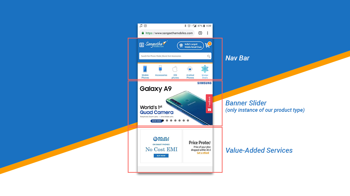
Here’s what you’re greeted with when you walk through our digital doors -
- The Nav Bar
- Only one phone image in a slider, usually the latest release
- Sangeetha’s Value Added Service, the perks of buying from us
How could the offline store-like experience of being at “the largest mobile retailer in South India”, be brought over to the online virtual world?
With just a glance at the home page, how can we elicit the same emotion?
Is there a better way to give the user a better first impression of our site, and intrigue them enough to scroll?
Thinking Out Loud
The store experience had to be broken down at first. What made it so great was -
- Visibility - you could see all your options
- Presentation - the phones had their own special showcase, banners and the works
- A Salesman - someone to guide the customers to the right phone
Many users don’t mind using older phones, as long as it satisfies their base needs.
Coupled with the drop in price, potential customers just need to be informed of these options. Bringing an equivalent of this to the online experience would be the ideal solution.
Making better use of the space at the start of the home screen. Having more space to work with makes things easier.
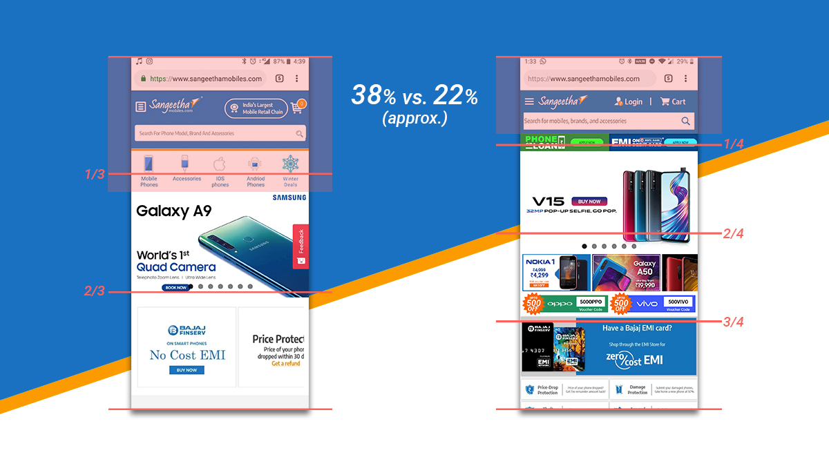
I found that the navigation bar takes up a little more than 1/3rd of the average phone screen. That’s around 38% of a 18:9 display. This relies on the user scrolling through before they discover the heart of the site. But considering how things are laid out, they aren’t really given incentive to scroll further.
The first thing to focus on was quite obvious - reworking the navigation bar. It took up too much space, and its function did not justify its size. Especially the third row, the popular categories. Laying the home page out better would let us move those options to the hamburger menu, clearing up even more space for us to showcase our products.
Constraints of the technology used to build the website meant that the website had some outdated components. We didn’t have a menu bar that collapsed into a smaller one when scrolling. It would disappear, leaving our users without a way to navigate or search. If a user is browsing the website and they don’t find what they’re looking for, the search bar should instantly be there to aid them.
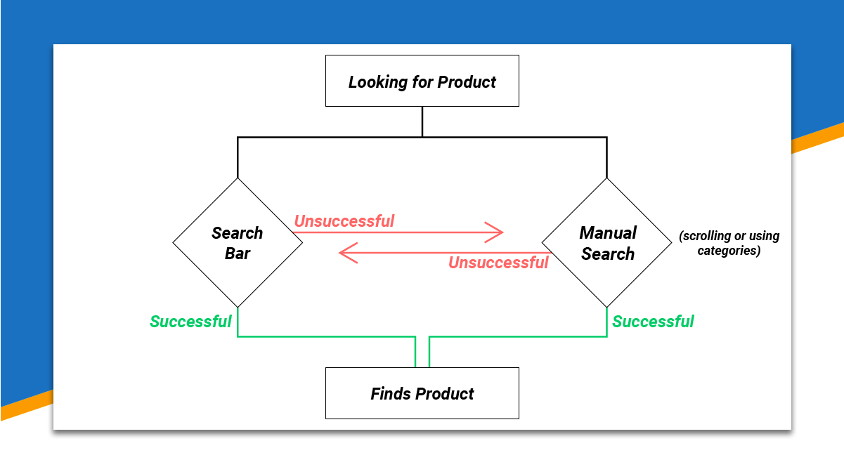
But a persistent search bar wouldn’t solve the problem either. The challenge came in finding the sweet spot between giving the user as much functionality everywhere they go, while also not blocking their field of view. If you were in a store looking for a phone and have 7 store boys surrounding you, you can’t see what you’re looking for. The store analogy is courtesy of the company being more popular as an offline retail brand.
I proposed that the navigation bar be resized and made a little more concise, with the notable change being the 3rd column being removed. This cleaned up a lot more space for us to stack up the metaphorical shelves with mobiles. But wait, does it have to be metaphorical?
After a quick look at the competitors nav-bars, they all seemed to be following a standard format with them, especially in terms of size. So rather than reinvent the perfectly functional wheel, I took my design cues from them and created my version.
Now I had a lot more empty space. I decided to use it to highlight specific phones and drive sales towards them. I played around with designing mini-banners for individual phones. From a previous experiment, I found that placing it right under the banner slider provides a great amount of visibility.
Putting It All Together
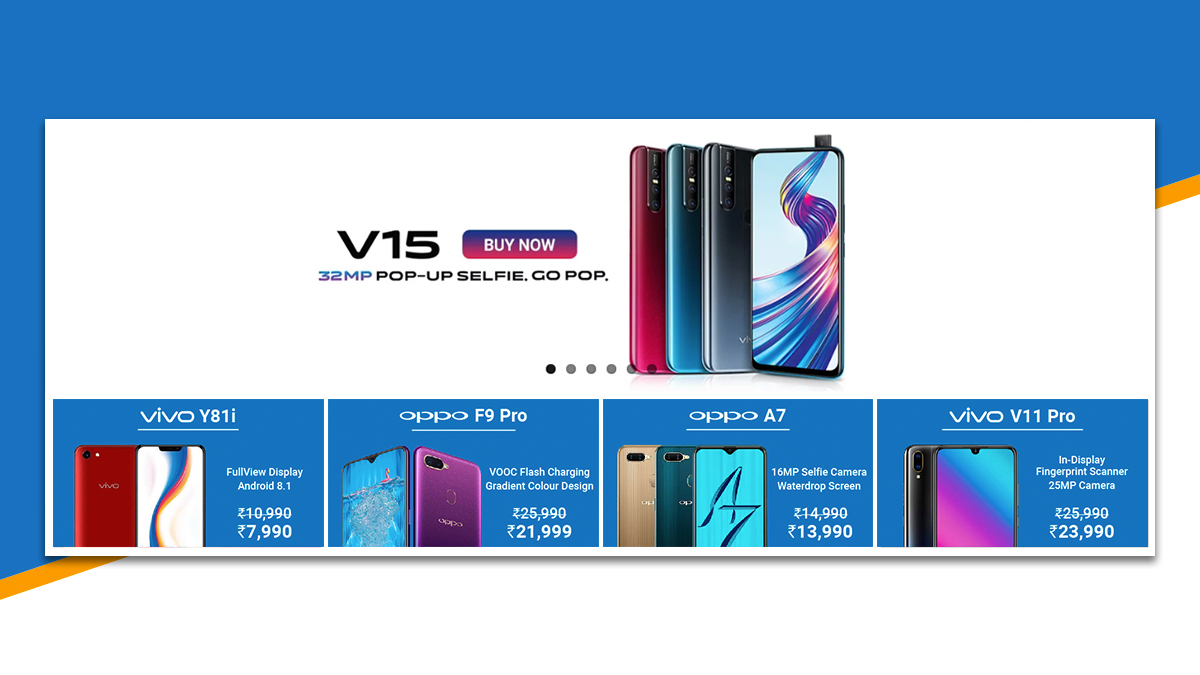
Keeping the less picky customers in mind, EOL phones were curated for this new section, with their most promising features highlighted. Four phone cards were placed right under the banner sliders. These phones were picked carefully to represent different price ranges, each had one tagline attached to them, and then features specified. This worked very well.
In the mobile version, using a slider with snapping disabled, I was able to highlight 5 phones. The third card peeked out a little, so people were nudged to scroll to see the remaining phone cards on display.
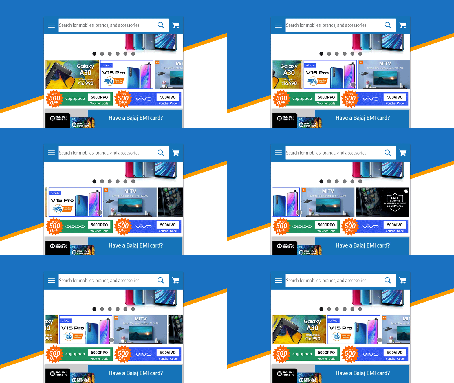
This was combined with picking popular phones based on Hotjar heatmaps and general knowledge of what phones are currently trending. This should lead to increased conversions for whichever models are specified in this new section.
Final Proposal
The proposal presented a website that welcomes you with the ‘what’ and ‘how’ of Sangeetha. A new section would be added to highlight older phones, while a redesigned nav-bar would increase product visibility throughout the website.
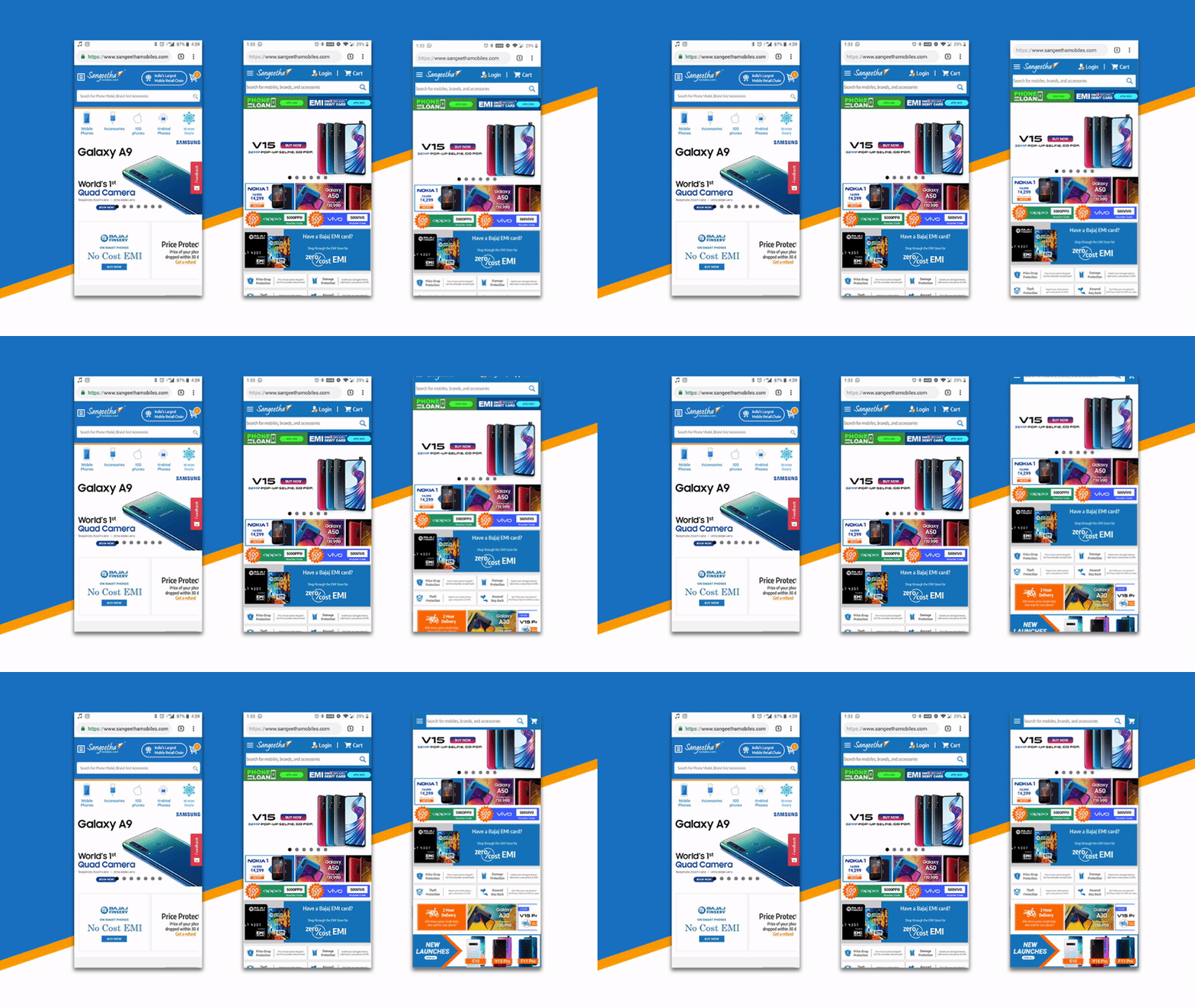
Even before the user has to scroll, they can see a range of phones, finance options and even value-added services. When they do scroll, the 2 column navigation bar collapses into a compact nav-bar that follows, without compromising the view of the products.
The redesigned navigation bar would take up less than one quarter of the screen (that’s roughly 22% of the same display). And that is including the browser tab bar. While scrolling, the minimized tab bar takes up only 6.8% of the screen. Ladies and gentlemen, the products are visible again!
Aftermath
The new section to highlight phones was given the okay to be implemented. The nav-bar was decided against due to the technical constraints of the platform.
But here’s the good news, the highlighted phones saw significantly increased traffic! One of the phones highlighted in the new section was a particularly old phone, from 2014. Within a week, this phone was sold out. This section has since been kept as a permanent part of the website.
