
The purpose of this project was to see how existing apps could extend their functionality over to a wearable.
This entire project was planned and executed by me.
Personal Project
I wanted to design an app for wearOS. Not just any watch interface, but an Android watch in particular. I’m obsessed with the round watchfaces and think this is the right direction for watch UIs, so I’m slightly #teamAesthetics over usability. “How dare he say that, he’s such a graphic designer!” - I know.
Building a companion app to an existing product was my agenda, and not something from scratch. After a quick scroll through the apps on my phone, the BookMyShow app seemed like exactly what I wanted to go with, and it didn’t have an existing companion app. I started looking into what could be done on that front, what problem could be solved by a wearable in particular. Because people obviously don’t want to book movie tickets on their watches...right?
This is an exploration of how the services of a ticket booking platform could be extended onto a wearable.
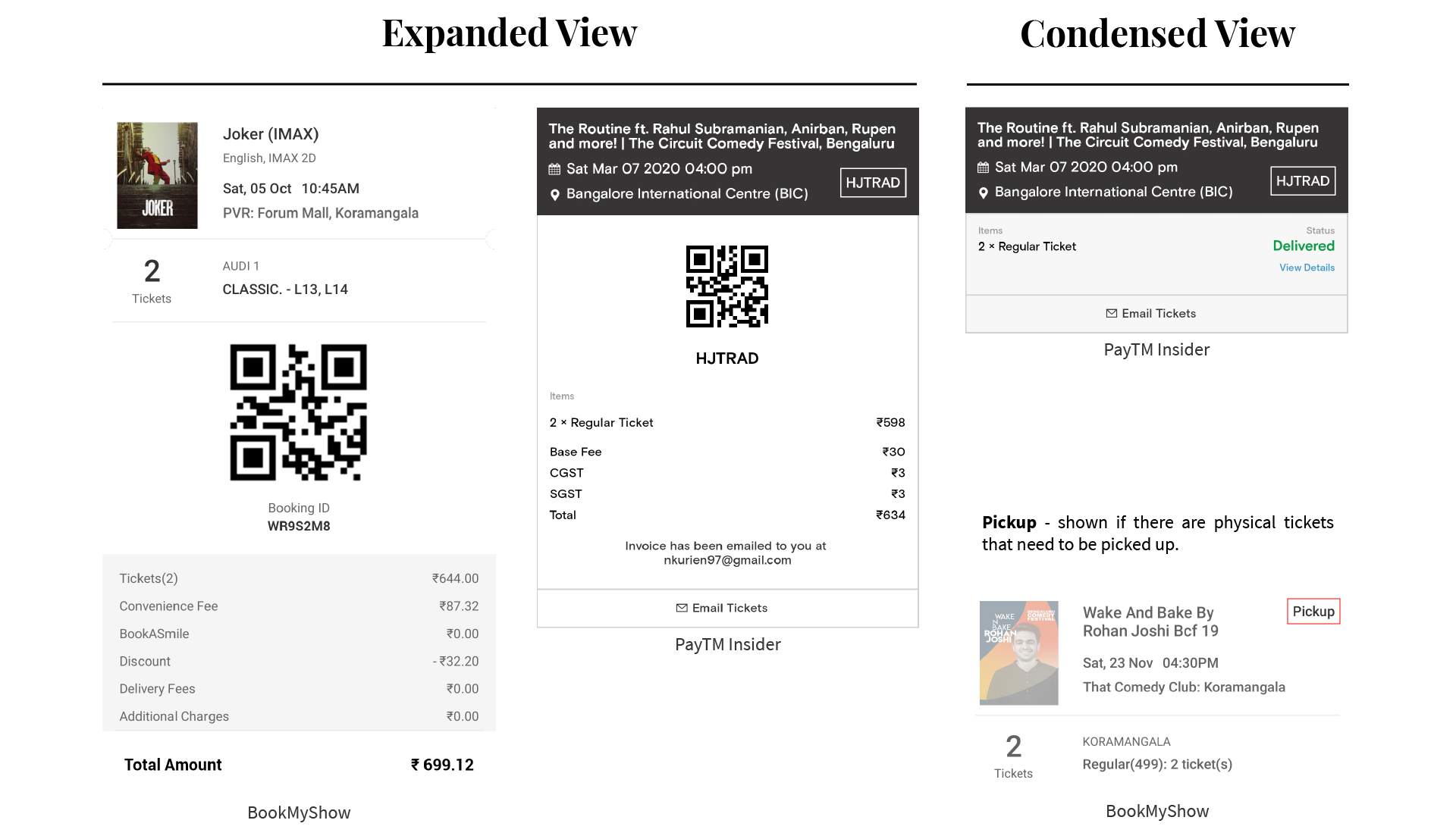
After going through the app, I narrowed in on the ticket page - a simple section of the app that displayed the tickets you’ve purchased, with their ‘when’ and ‘where’ details. All the essential information you need to get yourself seated at the venue. Ironically, all this information is needed just when people shouldn’t be using their smartphone. We’ve all been annoyed by those people shining their torches in a theater, looking for their seat.
Mapping the user journey was the first thing I had to do.

Correlating this with all the information that is on these tickets was up next. My companion app is exactly that - a companion. So it had to work on the existing data fields in the app. I looked through the e-tickets I had (I used BookMyShow and PayTM Insider as a reference) to see what information they had on them.
With this as a base, I contextualised the details and figured out what was essential to the core user experience. Keeping in mind the main goal of all wearable apps is to provide a focused experience, I prioritized the information. How much could you digest with just a glance? With the display size in mind, how much could I fit without overloading the user with information?
Parallely, I also looked up if it would be technologically possible to implement another idea I had - contextual actions. Displaying the right information at the right time is good, but completely eliminating the need for a phone would be perfect. I found exactly what I was looking for after looking through the dev docs again. Primary action buttons!
I fleshed out my idea and arranged things into the flow. All the information in order of when they’d be needed, coupled with their corresponding actions. My information architecture was ready.

Most watch concepts online are for the Apple Watch, so I had a lot of homework to do figuring out wearOS. I deep-dived into Google's guidelines first. I don’t own a smartwatch, so I looked everywhere for references on what the UI allowed - from watching YouTube videos about wearOS apps to screenshots from the Play Store app listings. The most helpful was this UI kit I found, which helped me get my aesthetic in line with the stock wearOS look.
These are some of the top-level design decisions I had to make:-
Native app navigation worked in its own way on wearOS. Apps are allowed to have categories that are paginated horizontally, with their information and functions accessible via a vertical scroll under each respective category.
Since my app is designed to be focused, I decided to go with only pagination. Swiping horizontally has a natural sense of task completion while focusing on only the current task. It also aligned perfectly with how my screens were laid out.
This was an easy choice to make. Between movie theaters and many events being in the evening, my calculated assumption was that this app would be used most often in the dark. A dark theme would cause the least amount of distraction in such environments. This would be appreciated by anyone who stood to be distracted by people stumbling around, looking for their seat in the dark.
Horizontal pagination keeps individual tasks focused, while a dark theme ensures other people aren't distracted as you get to your seat.

This is the first instance of the app and is a reminder. It informs the user that the event is happening soon, in how long, where and then prompts them to open Maps to get themselves there.
An important design decision I made here was to not be specific with how much time they had until the start of the event. I looked up the psychology behind countdown timers - they are used to incentivise current tasks and prioritise task completion. Considering my user’s current task would be to commute to the venue, I wanted them to prioritise safety, not task completion.
A countdown triggers a subconscious sense of task urgency, which could lead to the user ignoring their safety in an attempt to beat the clock. So I chose to hide the precise time left and only show a rough figure, conveying only the relevant information.
While time is an important factor throughout the journey, I was willing to sacrifice that level of specificity. As the age old saying goes, safety first.
Once they get to the venue, how entry is going to work is the next question. This screen will ideally show them the location of the box office. With different venues, comes different box office placement. Some theaters have them on the same floor, but this it’s different depending on the nature of the event. This data field also doesn’t exist on current tickets, so I exercised some creative freedom while designing this.
Alternatively, if the venue supports e-tickets, this screen will inform the user and direct them right to the entry gate.
Just below the current time on this screen, it shows the time of the show and a countdown clock. Once the user is past the Google Navigation screen, it seemed like a safe time to let them know the time until their event starts. They wouldn't have to deal with the cognitive load of calculating it based on the current time and event time.
Whether it’s at the gate or the box office, the user will have to show them confirmation that they bought a ticket. A QR code usually handles this part.
If not, the action button will open the receipt in the phone app. Touching the QR code zooms in, minimising any problems that could arise because of the watch screen size.
This page makes sure you get to your seat easily, and safely. The action button on this page turns your screen theme light, and acts as a flashlight. No more having to pick between your bright phone flashlight or dim screen light!
When the user reaches their screen, I thought the most appropriate action button would be to put their phone on silent. Additionally, it reminds them how long the event is expected to be.
Combining this aesthetic with my outline, I had my final screens.